ad. When I first started painting with watercolours, I bought a tin of 50 colours on Amazon. For someone just dipping their toes in, it was perfect – affordable, gave me loads of colours to experiment with, and helped me figure out what I actually liked painting with.
If you’re a watercolour beginner staring at rows of paint tubes or tins, wondering where to start, I get it. The overwhelm is real. But here’s what I’ve learned in my short time painting: setting up your first watercolour palette doesn’t need to be complicated. In fact, there’s a natural progression most of us follow.
- Why I Switched from 50 Colours to Professional Paints
- Understanding the Colour Wheel and Primary Colours
- My First Professional Watercolour Palette
- Comparing Professional Watercolour Paints: Winsor & Newton, MaimeriBlu, and Daniel Smith
- My Advice: Start with a Cheap Set, Then Upgrade
- Choosing Your Palette: Plastic vs Ceramic
- Setting Up Your Watercolour Palette
- Fresh Paint vs Dried Pans: What Works Best?
- Common Mistakes to Avoid
- Expanding Your Palette as You Grow
- Your Watercolour Palette Setup: Key Takeaways
- Final Thoughts

Why I Switched from 50 Colours to Professional Paints
That 50-colour Amazon tin? It was a brilliant starting point. I got to play around with different colours, discover which shades I gravitated towards, and learn the basics without spending a fortune. For watercolour beginners, these sets are genuinely a great way to start.
This is the starter kit I got!
But after painting for a few weeks (I started on 5th January, so I’m still pretty new to this!), I began noticing the limitations. The chalkiness of those cheap palettes was the biggest negative. The paints wouldn’t blend as smoothly, the colours looked a bit muddy, and I found myself getting frustrated.
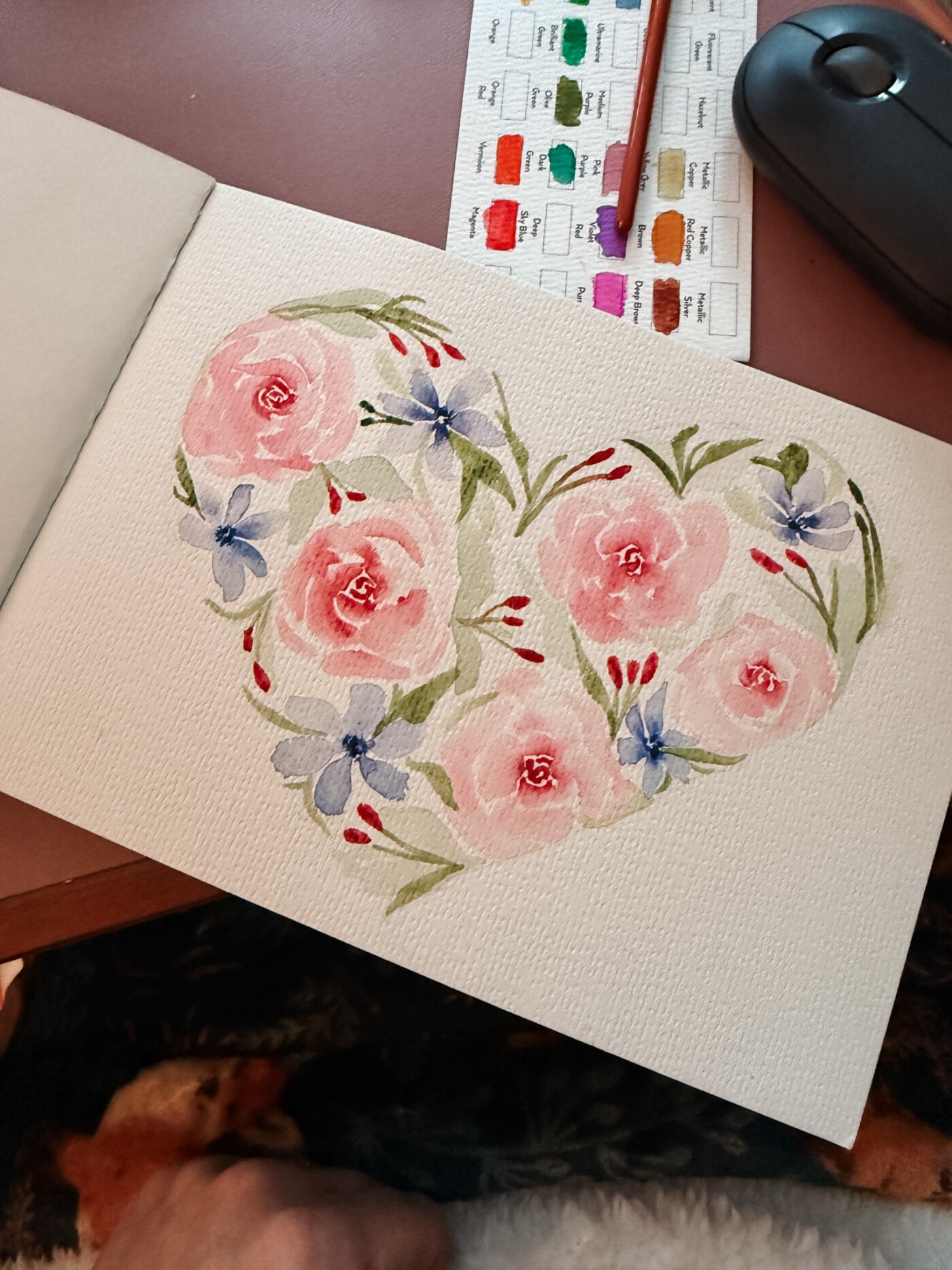
I wanted to move to professional colours, but more importantly, I wanted to narrow down my choices for a more cohesive palette. If you’re committed to watercolour and want to take it further, investing in quality paints makes a real difference.
Understanding the Colour Wheel and Primary Colours
Before we dive into my palette setup, let’s talk about the colour wheel. This is genuinely the funnest part of the prepping process once you understand it.
The colour wheel shows you how colours relate to each other. At its core are the primary colours: red, yellow, and blue. Here’s the clever bit – you can mix almost any colour from just these three.
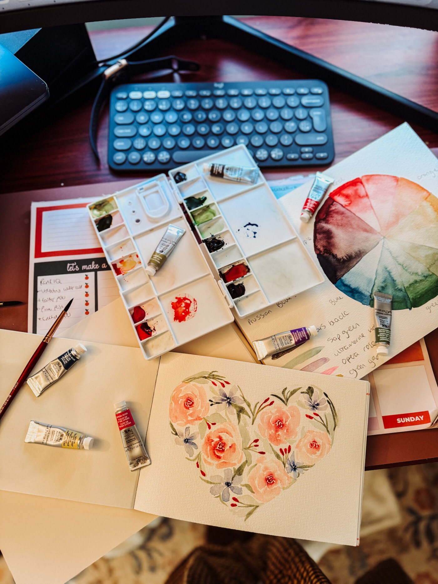
But professional artists take it a step further with what’s called split primaries or a primary palette. This means having both cool and warm versions of each primary colour. A cool yellow (like Lemon Yellow Deep) leans towards green, whilst a warm yellow leans towards orange. The same goes for your reds and blues.
This setup gives you so much more mixing potential. Cool primaries mixed together create vibrant colours without going muddy. A cool blue like Prussian Blue mixed with a cool yellow? That’s a gorgeous, bright green.
My First Professional Watercolour Palette
After watching a lot of videos and doing my research, I made a list of 20 colours I wanted. But professional paints are expensive, so I didn’t want to buy them all at once. I’m a big fan of MaimeriBlu watercolours, but I started with Winsor & Newton Professional Watercolour Range because they were more accessible for me.
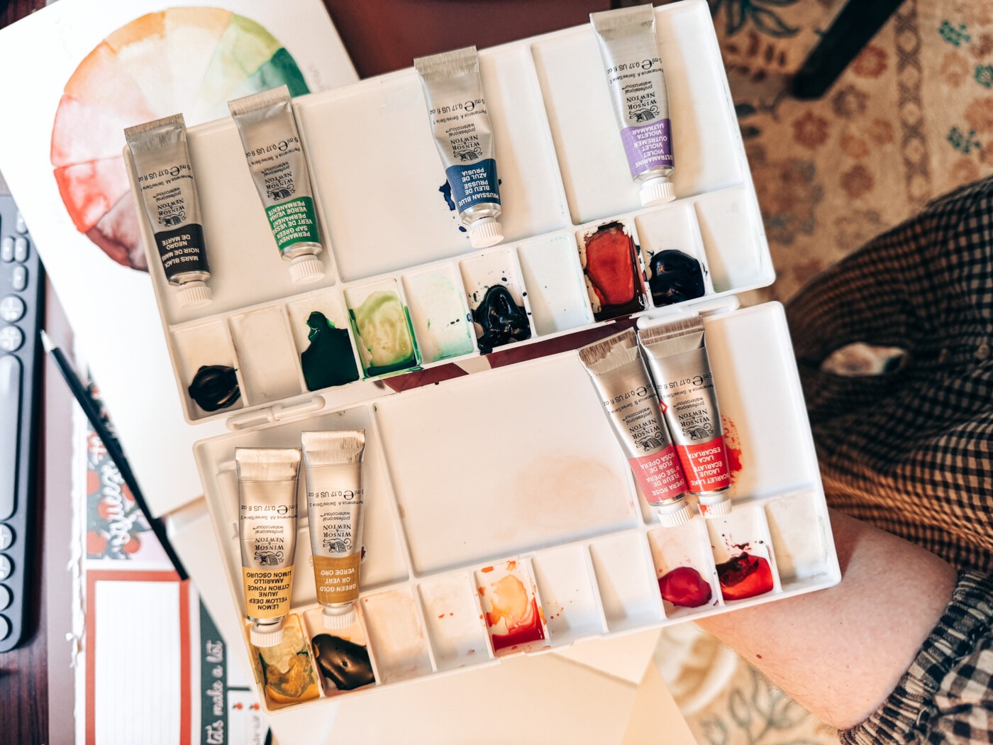
Here are the 8 colours I began with:
- Mars Black – for deep, rich darks (buy here)
- Sap Green – my go-to for foliage
- Prussian Blue – a cool blue that mixes beautifully (buy here)
- Ultramarine Violet – adds depth and gorgeous shadows
- Scarlet Lake – a vibrant, warm red (buy here)
- Opera Rose – because sometimes you need that pop of pink (buy here)
- Green Gold – a unique colour that’s become essential (buy here)
- Lemon Yellow Deep – my cool yellow for bright mixes (buy here)
Is this the perfect palette? I’m still learning, so who knows! But it’s been a great way to start understanding different pigments and how they work together. I feel like I would love a deeper pink/red, though – something like a crimson, as I love to paint pink flowers, and I’m struggling to get a rich, deep colour with Opera Rose as it’s lighter.
Comparing Professional Watercolour Paints: Winsor & Newton, MaimeriBlu, and Daniel Smith
Right, so you’re probably wondering why I went with Winsor & Newton when I’d been eyeing up Daniel Smith. Here’s the thing about professional watercolours: each brand has its own personality, and they’re all brilliant in different ways.
Winsor & Newton Professional Watercolour is often seen as the most balanced option. It’s reliable, predictable, and beautifully consistent – which is exactly what I wanted as someone fairly new to this. You get excellent colour without any weird surprises. It just… works.
MaimeriBlu leans more towards richness and tradition. The paints are heavily pigmented, slightly creamier in texture, and known for their depth and elegance. If you’re into earth tones and blues, MaimeriBlu is particularly gorgeous. There’s something quite lovely about how weighty the colours feel.
Daniel Smith is the experimental powerhouse. They’ve got an enormous range of colours, including loads of single-pigment and mineral-based paints. What makes them special is the granulation, texture, and uniqueness you get – perfect if you love expressive effects and want your pigments to have real personality. They’re definitely on my list to try properly once I’ve got more experience under my belt.
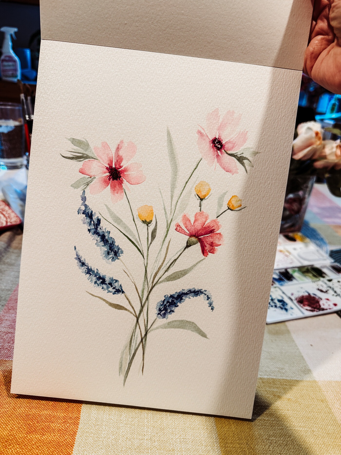
What About Winsor & Newton Cotman?
Before we get too deep into professional paints, it’s worth mentioning Winsor & Newton Cotman Watercolour. This is their student-grade line, and it uses slightly less pigment with more fillers to keep costs down.
That said, Cotman paints are still of very good quality for beginners and intermediates. They’re far smoother and more reliable than those cheap Amazon sets – though those sets are still brilliant for absolute beginners who want to experiment without spending much. Cotman sits nicely in the middle as an excellent stepping stone before you commit to professional tubes, especially if you’re still figuring out your colour preferences.
Colour Comparisons Across Brands
Since I went with Winsor & Newton but had been researching other brands, I thought it might be useful to show you how my current colours compare to MaimeriBlu and Daniel Smith equivalents. Exact matches don’t always exist, but these are the most commonly recommended alternatives:
| Winsor & Newton Colour | Purpose / Notes | MaimeriBlu Alternative | Daniel Smith Alternative |
|---|---|---|---|
| Mars Black | Deep, rich neutral dark | Mars Black | Mars Black |
| Sap Green | Ready-made foliage green | Sap Green | Sap Green |
| Prussian Blue | Cool blue, strong mixer | Prussian Blue | Prussian Blue |
| Ultramarine Violet | Soft shadows, granulation | Ultramarine Violet | Ultramarine Violet |
| Scarlet Lake | Warm, vibrant red | Scarlet Red | Pyrrol Scarlet |
| Opera Rose | Bright, high-chroma pink | Opera Rose | Opera Pink |
| Green Gold | Warm yellow-green, glowing mixes | Green Gold | Green Gold |
| Lemon Yellow Deep | Cool yellow for clean mixes | Lemon Yellow | Lemon Yellow |
A quick note on Opera colours: Across all brands, Opera shades are usually fugitive (less lightfast), so they’re best used for sketchbooks, studies, or pieces not intended for long-term display. Something worth keeping in mind as you grow and start thinking about which paintings you want to last.
My Advice: Start with a Cheap Set, Then Upgrade
If you’re just starting out, don’t feel pressure to buy expensive professional paints straight away. A 50-colour set from Amazon is honestly perfect for beginners. It’s affordable, gives you variety, and helps you figure out which colours you actually use.
Once you’ve been painting for a bit and you know you want to stick with it, that’s when it makes sense to invest in quality watercolour. You’ll know which colours matter to you, and you won’t waste money on expensive paints you never reach for.
Choosing Your Palette: Plastic vs Ceramic
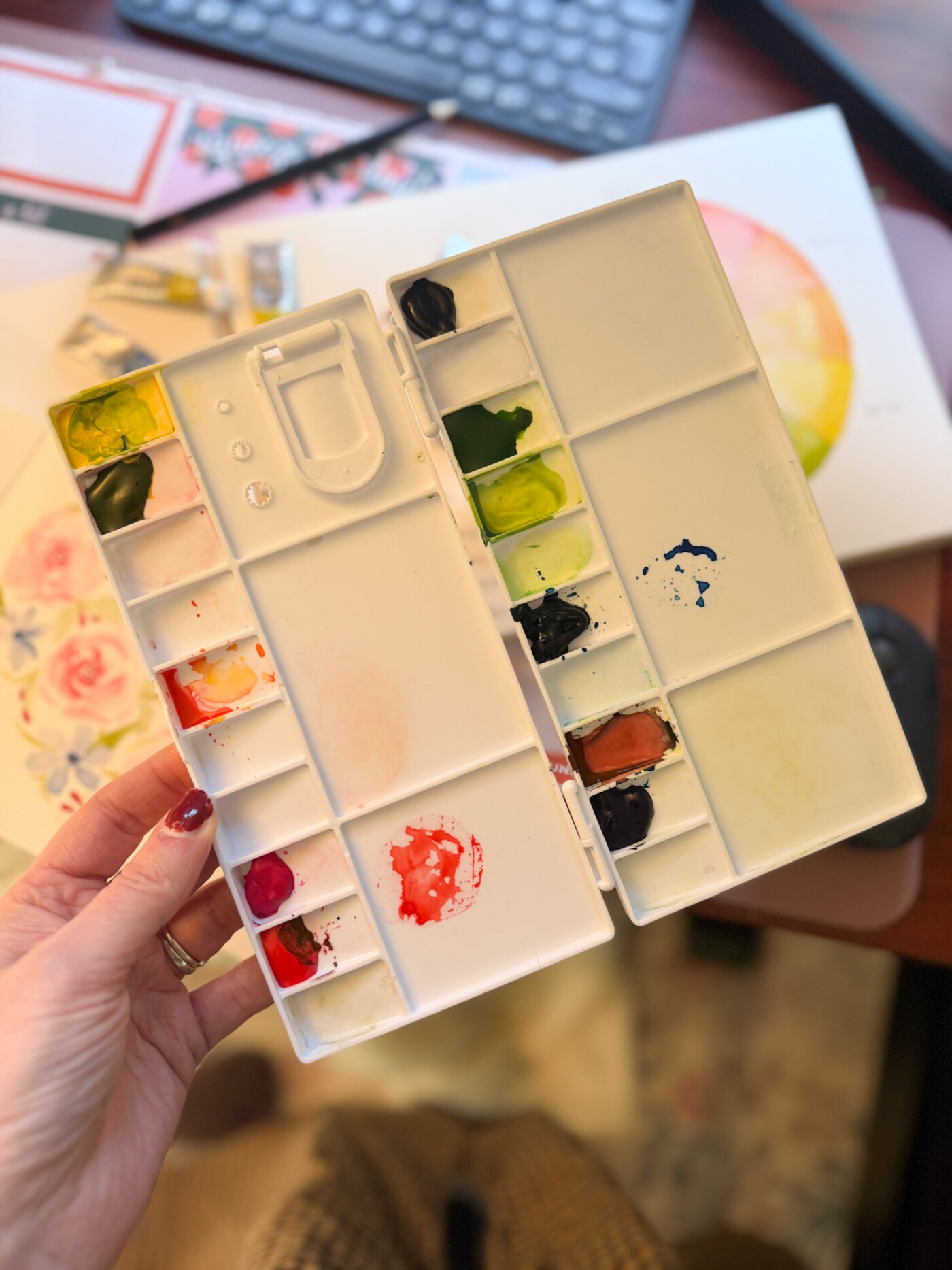
I went with this plastic palette from Amazon. Now, I know ceramic palettes are better for seeing paint colour accurately because they have a white surface that doesn’t stain. But here’s the thing – I paint in different areas of the house, and I needed something I could move around easily.
The plastic palette has plenty of wells for mixing, and whilst the slick surface can be annoying when you’ve got tiny dabs of paint that slide about, it does the job. The key is finding a palette with a clear mixing area that isn’t too cramped.
If you’re setting up for the first time, look for:
- A white or light-coloured mixing area (helps you see true colours)
- Decent-sized wells (rectangular palettes often have better space)
- A lid if you want to keep fresh paint moist between sessions
- Enough room at the deep end for proper mixing
Setting Up Your Watercolour Palette
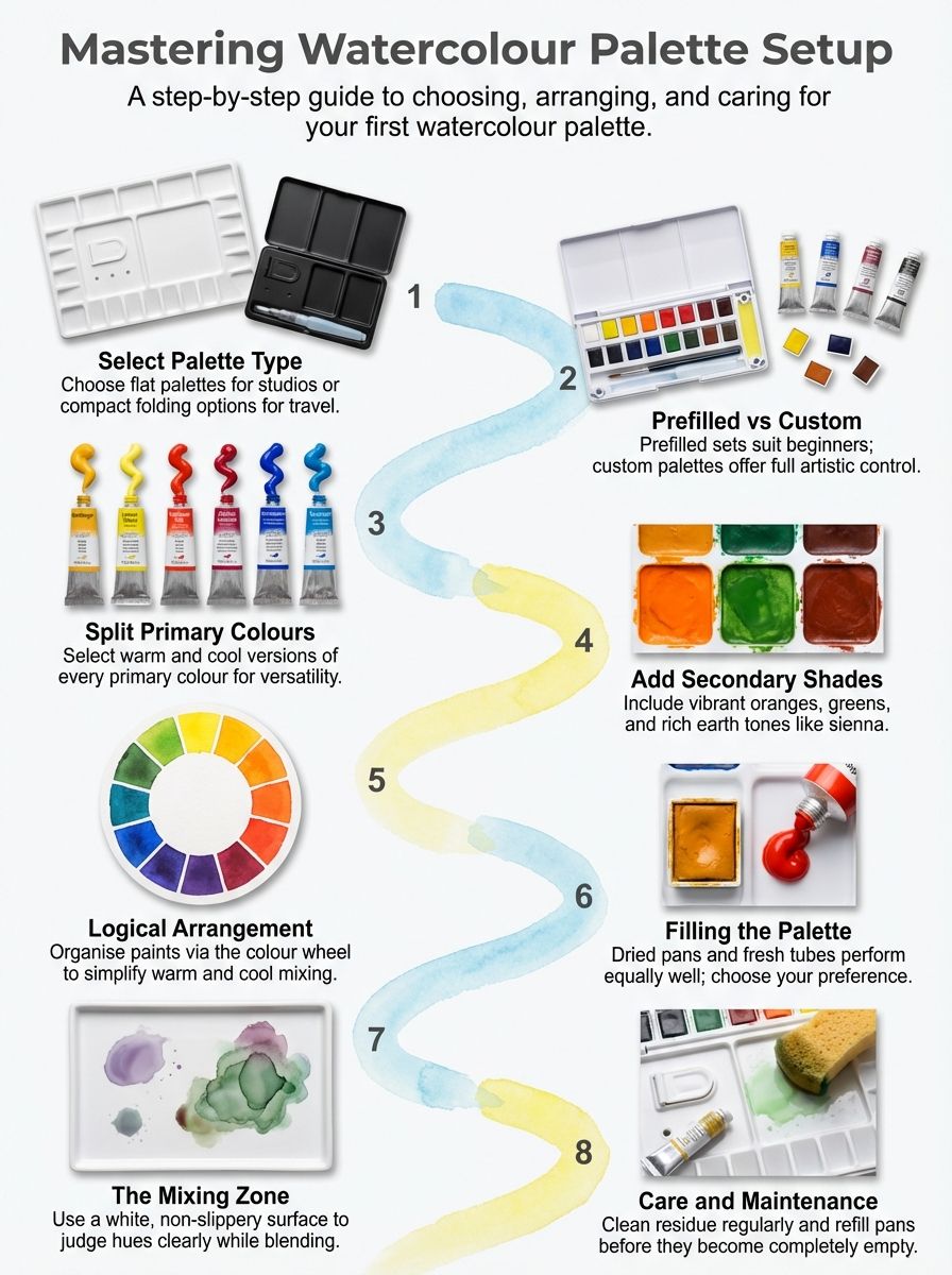
Here’s how I arrange my watercolour palette:
Start with your primary colours. Place your cool blue, cool yellow, and cool red on one side. Your warm versions go nearby. This follows the colour wheel, making mixing intuitive.
Add your earth tones. Colours like Burnt Umber and Sap Green sit well near your yellows and browns. Earth tones are perfect for landscapes and natural subjects.
Keep convenient colours accessible. I keep my most-used colours (for me, that’s Sap Green and Prussian Blue) right where I can reach them without having to think.
Leave space for mixing. This was a revelation. Don’t fill every single well. You need room for paint mixes and layering colours.
Fresh Paint vs Dried Pans: What Works Best?
When you’re filling your new palette, you have two options: squeeze fresh paint directly from tubes or let it dry into pans.
I prefer using dry paint when I’m working. I squeeze a small amount into each well, leave it overnight and then use it. I find this the most cost-effective way, and I’m always ready to go. People say the colours are more vibrant straight from the tube, but I hate waste.
But here’s the great way to manage it: squeeze your paint into the wells and let it air dry for a day or two. This way, you get the best of both worlds. The paint stays in your palette without wasting tubes, but you can reactivate it with water whenever you need it.
Top tip: Don’t fill the well completely as it will take longer to dry; it’s best to fill a third of the way, then the next day top up until you’ve got enough. You’ll thank yourself later when you’re not constantly running out mid-painting.
Common Mistakes to Avoid
Mistake #1: Buying expensive paints before you know what you like. Start with a cheap set, experiment, then invest in quality once you know you’re committed.
Mistake #2: Buying pre-made professional sets without knowing what’s inside. Check the pigment numbers. Make sure you’re getting colours you’ll actually use.
Mistake #3: Not understanding warm vs cool. Once you grasp this concept, your watercolour pieces will transform. Cool primaries + cool primaries = brighter colours. Warm + cool = neutral, often muddy tones.
Mistake #4: Filling your palette to the brim. Leave empty wells. Trust me, you’ll want a mixing space.
Expanding Your Palette as You Grow
I’m still building my collection slowly. I’ve got that list of 20 colours, and I’m adding to it as I go. Next on my list are some earth tones like Raw Sienna, and I’m tempted by some of those gorgeous Daniel Smith watercolours with unique pigments.
The beauty of starting with a basic set and then moving to a smaller professional palette? You learn which colours you reach for constantly (for me, Prussian Blue and Sap Green) versus which sit unused. This helps you make smarter choices as you expand.
Your Watercolour Palette Setup: Key Takeaways
If you’re setting up your first watercolour palette, here’s my advice:
- Start with an affordable set to experiment and learn. Those 50-colour tins from Amazon are brilliant for beginners.
- Once you’re committed, invest in quality paints. Start with 6-12 professional colours. Get your split primaries sorted (cool and warm versions of red, yellow, blue), add a couple of earth tones, and a dark.
- Choose the right palette for your lifestyle. Ceramic is lovely, but if you need to move about, plastic works brilliantly.
- Learn the colour wheel. Understanding how to mix vibrant colours from primaries means you need fewer tubes when you do upgrade.
- Don’t rush it. I’ve only been painting since early January, and I’m still learning. There’s no pressure to have the “perfect” setup immediately.
Final Thoughts
Setting up your watercolour palette is genuinely one of the funnest parts of starting your painting journey. Yes, it can feel overwhelming when you’re faced with hundreds of colour options. But there’s a natural progression: start affordable, experiment lots, then invest in quality once you know what you love.
My advice? Grab a cheap set, play around, and don’t stress about having the “right” colours. Once you know you want to stick with watercolour, that’s when you can build a more curated palette with quality watercolour paints.
Your first watercolour palette doesn’t need to be perfect. It just needs to get you painting.
Now, if you’ll excuse me, I’ve got some Prussian Blue calling my name.
What colours are in your palette? I’d love to hear about your watercolour palette setup – especially if you’ve made any brilliant discoveries or spectacular mistakes along the way!
Related Reading:
This post contains affiliate links.
That is some great information if I wanted to ever start watercoloring. Thanks for sharing.